

Role: Art Direction
Project Type: Visual Identity, Marketing Collateral, Digital Ads
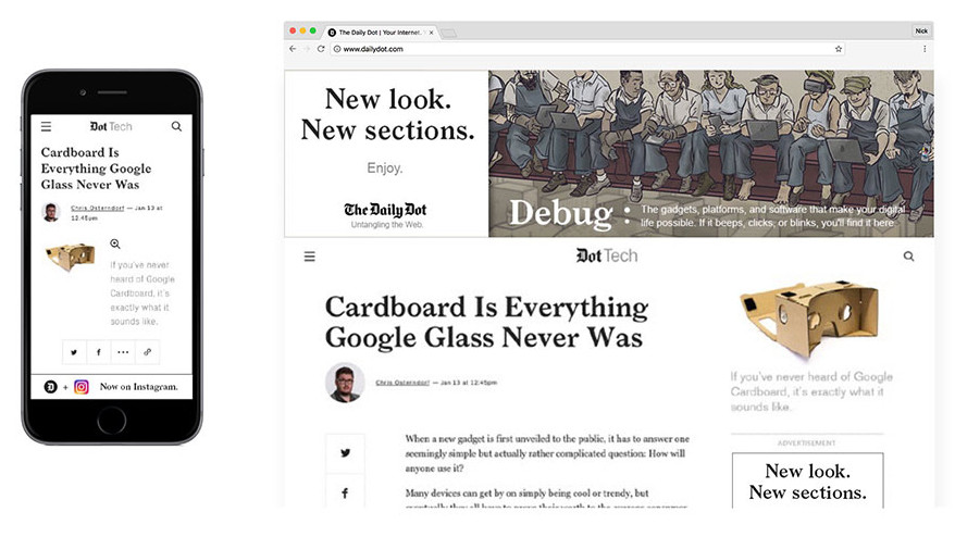
In mid-2016, The Daily Dot completely redesigned their website, not only updating an aesthetic that was woefully out of date, but also restructuring how their content was organized. While it started as an aesthetic refresh, it quickly became a more strategic repositioning of our verticals.
Following the redesign, which was done by an outside design agency, I was tasked with translating our new aesthetic into a visual style that could be standardized across the entire company. I created a company-wide style guide that could be used both by the sales and marketing team as well as our editorial staff.
 |  |  |
|---|---|---|
 |  |  |
 |  |  |
 |  |  |
 |  |  |
 |  |  |
 |  |  |
 |  |  |
 |  |  |
 |  |  |
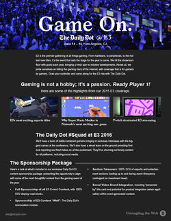
Our most important piece of collateral is our Media Kit. This is how we introduce ourselves to potential partners, and it sets the tone for our brand and all of our subsequent communications. As a relatively unknown publisher, I knew that we had to make a great first impression.
 |  |  |
|---|---|---|
 |  |  |
 |  |  |
 |  |  |
 |
After delivering our Media Kit, we follow up with additional collateral that details out more specifics on our coverage, our audience, and sponsorship opportunities.
 |  |
|---|---|
 |  |
 |  |
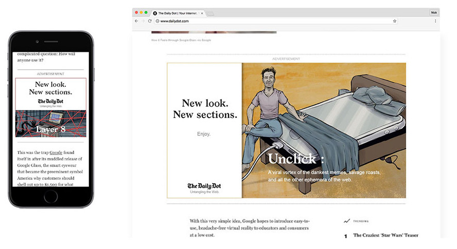
Once the redesign went live, we wanted to introduce readers to our new sections and encourage them to explore the new site. I created banner ads that showcased our original editorial art, explained a bit about the new sections, and prompted users to dive in.

As a lot of our audience comes to The Daily Dot through social media, we wanted to create new cover art for all of our accounts. Our content is relatively broad, covering everything from cybersecurity to geek culture to streaming entertainment. I wanted to design something that would not only showcase the kind of subjects we write about but also communicate a balanced tone between fun and serious.


cover art in use on our twitter page